Stork Cosmetics
Branding & Packaging Design2020

Concept packaging design project for Stork Cosmetics’ new Liquid Makeup product.
The new product line aims to have the largest range of matched skin tones on the market.
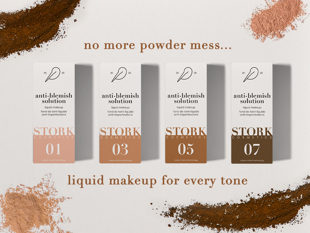
The packaging was designed to celebrate this large verity of makeup tones, while introducing a simple and clear numerical system for consumers to identify their suitable product.
Branding

Packaging
In order for the customer to easily identify their desired makeup tone, a colour shade and numerical identity system was devised for the front of the packaging.
This identity system provides the customer with two factors of identification for their desired makeup – colour & number. This helpful two-factor identification system is designed to cut down the time looking for the desired product.
The packaging was designed to celebrate the large verity of makeup tones - note that these mockups do not show the entirety of the available shades.


Designed by Scott McAdam
SCOTT MCADAM © 2021
SCOTT MCADAM © 2021